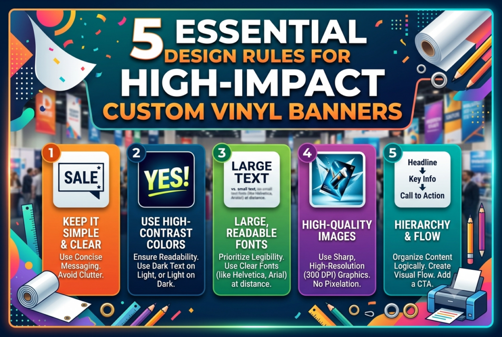
In today’s fast-paced marketplace, capturing consumer attention requires more than just a passing glance. Whether you are launching a product, promoting a local community event, or setting up a booth at a bustling trade show, visual communication remains a primary driver of foot traffic and brand awareness. Among the most versatile and cost-effective mediums at your disposal is large-format signage. However, simply hanging up a sign is not enough to guarantee success; the design must be intentional, striking, and optimized for viewer engagement.
To maximize your return on investment and ensure your message cuts through the visual noise, you need a strategic approach to layout and typography. A well-crafted custom vinyl banner acts as a silent salesperson, working around the clock to communicate your core value proposition from dozens of feet away. By adhering to time-tested graphic design principles, you can transform a basic piece of tarp into a high-impact marketing asset that commands attention, builds immediate trust, and drives concrete action.
1. Prioritize Extreme Legibility and Contrast
The human brain processes visual information in milliseconds. If a passerby cannot read your headline within three seconds, you have lost them. Legibility is the absolute cornerstone of effective large-format signage, dictating everything from font selection to color harmony.
- Select Clean Typefaces: Avoid overly ornate script fonts, heavily distressed typefaces, or thin serif styles that blur together from a distance. Stick to bold, clean sans-serif fonts like Helvetica, Montserrat, or Futura.
- Maximize Contrast: Ensure a high degree of contrast between your background color and your text. Dark text on a light background or bright, high-contrast text on a deep, saturated background works best. Never place dark text over a busy photographic background without a solid color block or gradient overlay underneath.
- Size Matters: A good rule of thumb for physical signage is that every inch of letter height gives you roughly ten feet of readable distance. If your audience will be viewing the sign from fifty feet away, your primary headline should be at least five inches tall.
2. Keep Your Messaging Concise and Focused
When it comes to outdoor or event marketing, less is almost always more. You are not writing a brochure or a landing page; you are capturing a fleeting moment of attention. Cramming your sign with dense paragraphs, excessive bullet points, and multiple website links will only overwhelm the viewer.
- The One-Second Rule: Focus on a single, primary objective. What is the one thing you want people to know or do?
- Hierarchy of Information: Structure your text into a clear visual hierarchy. Your main headline should deliver the hook or offer, a secondary sub-headline can provide brief context, and your call-to-action (CTA) should tell them what to do next.
- Cut the Fluff: Remove filler words like “welcome to our booth” or unnecessary corporate jargon that drains valuable real estate from your core message.
3. Leverage Scale and Strategic Placement
Designing a graphic on a high-resolution computer monitor can be deceptive. A text size that looks massive on your twenty-seven-inch desktop screen can easily look microscopic when hung across a wide convention hall or mounted on a sturdy canopy tent frame at an outdoor farmer’s market.
- Account for Environment: Consider where the sign will actually live. Will it be viewed from a moving car, by walking pedestrians, or across a crowded exhibition floor? Scale your elements accordingly.
- Mind the Margins: Keep vital elements—such as logos, phone numbers, and website URLs—at least a few inches away from the outer edges. This “safe zone” ensures that grommets, hems, or folding creases will not obscure or chop off critical information.
- Whitespace is Your Friend: Do not feel pressured to fill every square inch of empty space. Generous whitespace around your text and imagery actually draws the eye inward and makes the design feel professional and high-end.
4. Design for the Environment and Lighting
External factors play a massive role in how your visual marketing assets are perceived. Weather conditions, direct sunlight, shadows, and artificial convention center lighting can drastically alter how colors and finishes look in the real world.
- Color Psychology and Choice: Bright, vibrant colors look fantastic outdoors under natural sunlight, but pastel shades can get completely washed out. If your display will be used primarily at night or in dimly lit indoor venues, opt for deeply saturated, luminous color palettes.
- Matte vs. Glossy Finishes: Consider the finish of your material. Glossy surfaces offer rich, vibrant color pop but can create an intense, blinding glare under direct sunlight or harsh overhead spotlights. Matte finishes diffuse light evenly, making them much easier to read from multiple viewing angles regardless of lighting conditions.
- Durability Considerations: High-impact design also means accounting for physical longevity. Ensure your design file uses high-resolution vector assets (at least 150 DPI at actual printed size) so that the print remains crisp and professional even when exposed to harsh outdoor elements over time.
5. Incorporate a Clear and Urgent Call-to-Action (CTA)
A visually stunning display is ultimately useless if the viewer does not know what action to take next. Whether you want them to scan a QR code, visit a specific web page, or step inside your physical storefront, your call-to-action must be unmistakable and frictionless.
- Be Direct and Action-Oriented: Use strong verbs that prompt an immediate response. Phrases like “Scan to Claim Your Discount,” “Visit Booth 42,” or “Text JOIN to 555-0199” provide clear direction.
- Make Contact Info Prominent: If your primary goal is lead generation, make sure your phone number, social media handles, or website URL are large enough to be jotted down quickly or captured on a smartphone camera from a distance.
- Integrate Digital Triggers: Modern signage frequently bridges the physical and digital worlds. Incorporating a bold, easily scannable QR code directly into your layout allows potential customers to transition seamlessly from passive viewers to active digital leads in a single step.
Conclusion
Executing a successful large-format marketing campaign requires a careful balance of aesthetic restraint and strategic messaging. By prioritizing clean legibility, keeping your copy concise, scaling elements for real-world viewing conditions, accounting for environmental lighting, and anchoring your layout with a powerful call-to-action, you elevate your brand far above the competition. When every design element works in harmony, your visual displays become powerful growth engines that consistently capture attention, drive meaningful engagement, and deliver measurable results for your business.
FAQ
What makes a vinyl banner “high-impact”?
A high-impact banner combines bold typography, high-contrast colors, and a clear, minimal message that captures attention instantly from a distance.
What is the best font size for readability?
As a rule of thumb, use at least 1 inch of letter height for every 10 feet of viewing distance so motorists and pedestrians can read it easily.
How much text should be on the banner?
Keep it brief—aim for a single core message, your logo, and a strong call-to-action (like a website or phone number) within 5 to 7 words.
Which color combinations stand out most?
High-contrast pairings, such as dark text on a light background or bright white text on a deep navy or black background, offer the highest visibility.
Where is the best place to position the logo?
Place your logo at eye level or in the top-left corner, as this is where people naturally look first when scanning signage.